Skip to content
Hero shot of Serelepet retail packaging: stacked boxes and bags printed with the wordmark, coral and green brand colours, and pet-care product photography.

Branding & Visual Identity: Serelepet

Branding and visual identity consultancy for Serelepet, a petshop e-commerce focused on cuteness, care, and responsible pet ownership.

Period

Brand Identity · 2022

Focus

BrandingVisual IdentityE-commerce
Overview

Branding That Brings Warmth to Every Touchpoint

This project showcases brand strategy and visual identity work, complementing the product design case studies elsewhere in the portfolio.

Serelepet needed a visual identity that would stand out in a crowded pet product market while communicating trust, playfulness, and responsible ownership. Starting from zero, I developed the full brand system, from naming rationale to every touchpoint a customer would interact with.

My Role

Lead Designer & Brand Consultant

I led the full branding and visual identity consultancy, from strategic positioning and naming to logo design, color system, typography, iconography, packaging, and digital touchpoints. I was responsible for delivering a cohesive brand system ready for market launch.

The Product

Brand Identity

Two cream cardboard hang tags on twine showing the stacked Serelepet wordmark, the tagline "seu petshop 100% online" in coral, a mint strip with @lojaserelepet, and a light pattern of paws, dots, and a bone.
Close-up of the Serelepet logo printed on thick cream paper: lowercase charcoal wordmark with a coral circular dog icon around "pet", and the coral tagline "seu petshop 100% online" below.
A hand holds a small folded kraft pouch against a sage green background. A round sticker shows a minimal dog profile, cream and green rings, and @lojaserelepet repeated around the edge with small paw prints.
Brown kraft shopping bag with twisted handles on a soft peach backdrop. Large outlined Portuguese text reads "Todo dia é um bom dia quando você tem um pet"; the Serelepet logo, tagline, and @lojaserelepet appear near the bottom.
Two smartphone mockups side by side on a transparent background. Left screen: stacked Serelepet wordmark with coral dog icon and tagline "seu petshop 100% online". Right screen: brand pattern grid in mint, coral, beige, and cream squares.
Two smartphone mockups on a transparent background. Left: Instagram-style grid with pet photos, products, Serelepet branding, "compre online" posts, and Petlove partnership. Right: three stacked product banners for parasite care, Golden Formula dog food with a golden retriever, and CarePet litter with a kitten.
Process

Designed to Delight

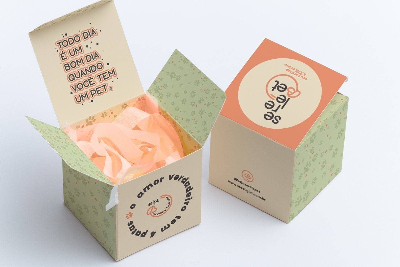
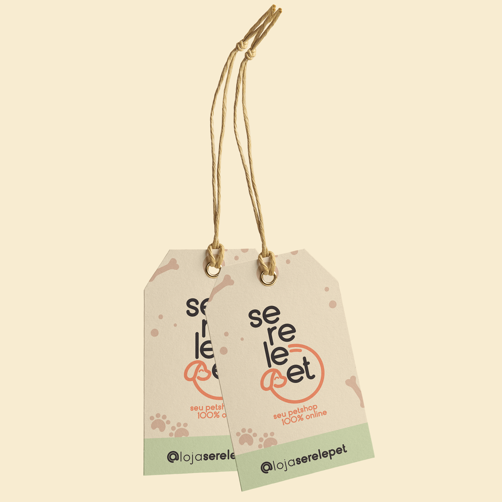
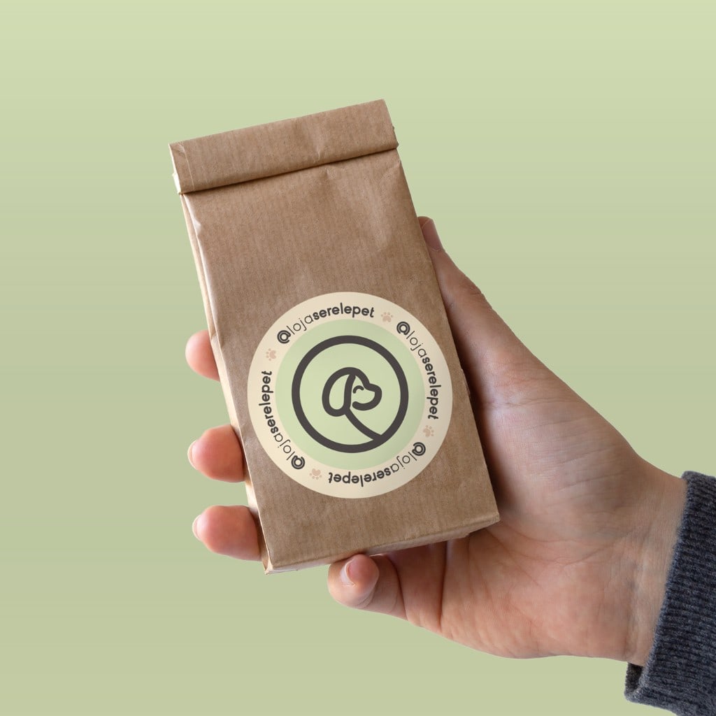
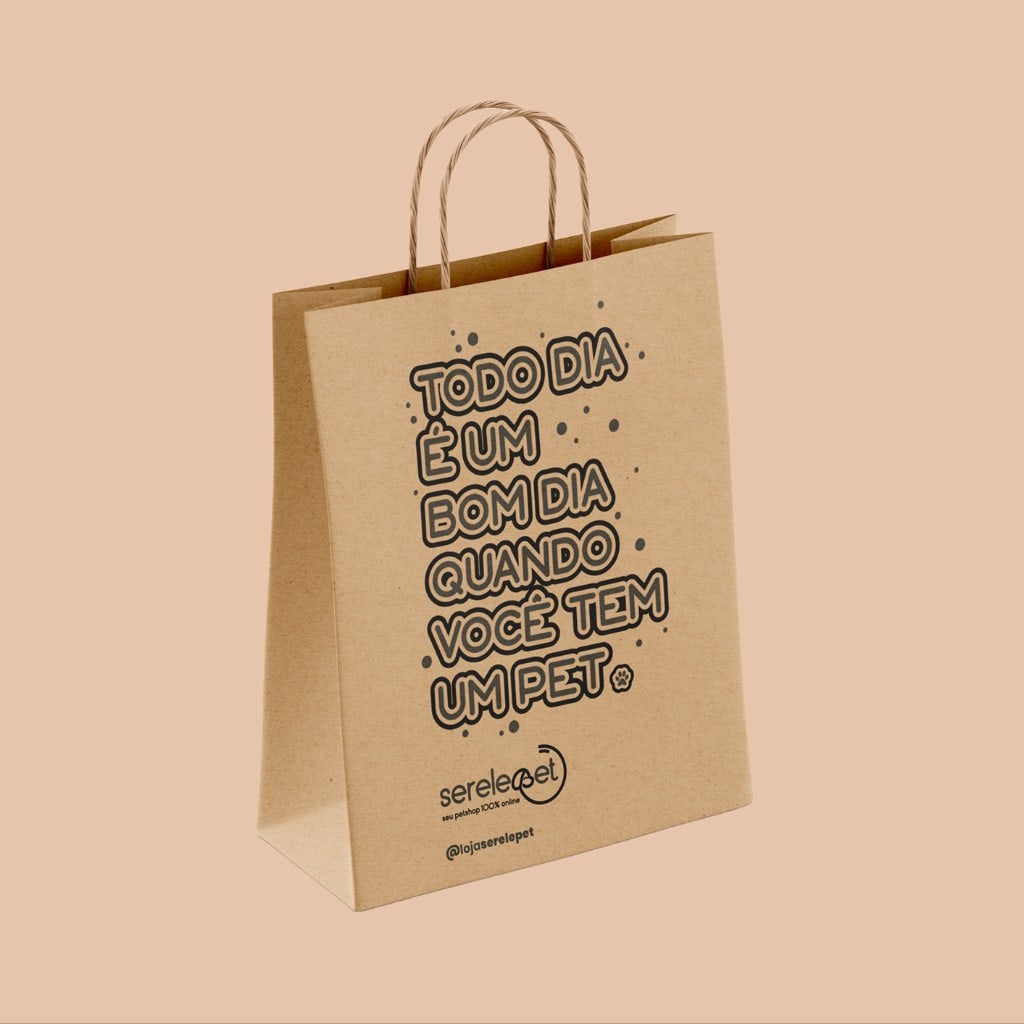
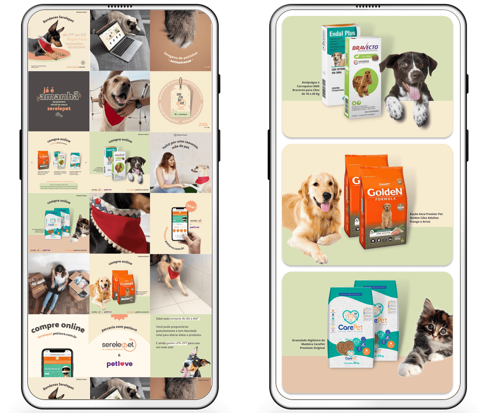
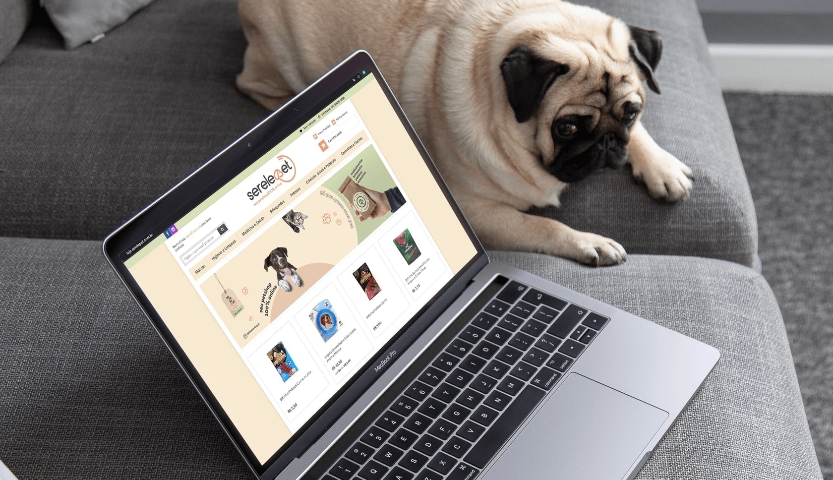
The brand system was applied across all customer touchpoints: packaging, stationery, digital surfaces, and in-store materials.

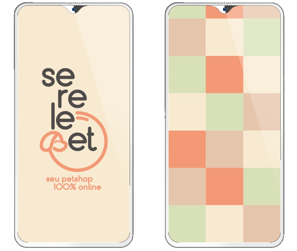
The color palette was chosen to be soft yet joyful, reflecting the warmth and care that pet owners feel for their companions. Pastel corals and greens communicate trust and playfulness without overwhelming the eye.

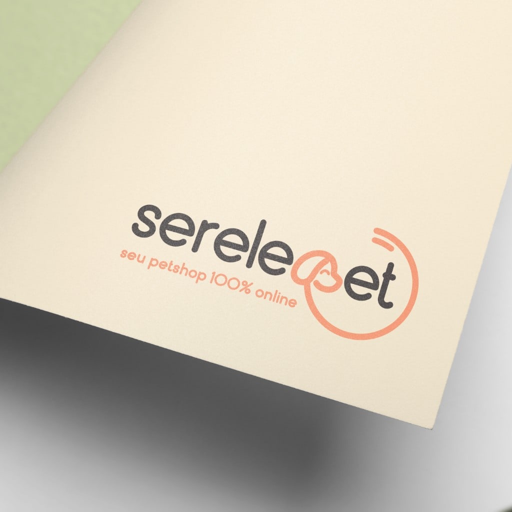
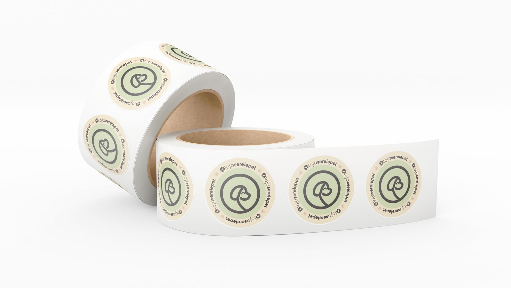
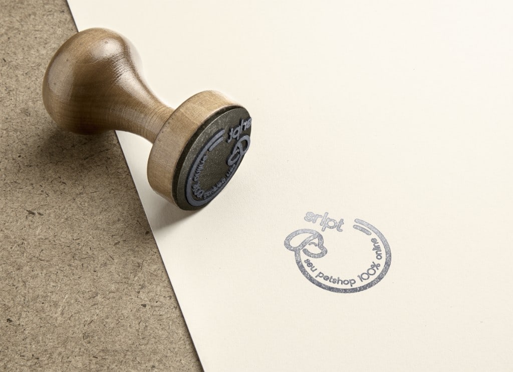
The logo itself tells a story: the mark is inspired by a dog chasing its own tail, capturing the playful, energetic spirit of the word serelepe (a Brazilian term for someone lively and restless). This playful motion became the brand's signature, appearing across packaging, stickers, and digital touchpoints.
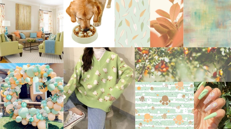
Moodboard

Brand moodboard in mint, peach, and coral: interior and lifestyle photos, a dog eating, foliage, textile and pattern swatches including leaves and paw prints, and manicure detail, establishing warm, pet-friendly visual references.

Color Palette

Serelepet colour system diagram: named swatches for primary coral, supporting greens and neutrals, with hex or role labels showing how each tone is used across digital and print.

Typography: Montserrat

Montserrat type specimen in dark grey: full alphabet in upper and lower case, numerals, and punctuation in a geometric sans-serif, demonstrating weight and character shapes for the Serelepet brand.

Icons

Serelepet logo lockups: circular badges with a minimal line dog head in coral, mint, and neutral rings, plus the horizontal logo with the tagline "seu petshop 100% online" in coral.

Logo development

Serelepet logo development: concept sketches, refinements, and final mark exploration on a light background.

Sticker

Rolls of round white stickers with a thin green border and the orange Serelepet pet-head icon in the centre, shown as physical packaging labels.
Result
Full-width screenshot of the live Serelepet storefront: header, hero banner, dog and cat category entry points, promotional modules, and footer links, using the brand’s coral and green UI accents.
Wooden hand stamp on cream cardstock beside a grey ink impression of the circular Serelepet mark: abbreviated wordmark, minimal line dog profile, and curved tagline "seu petshop 100% online", on textured neutral fibreboard.

Works as a store. Still feels like people who care about pets. Pets make life better.

Delivered a full brand system across packaging, digital storefront, stationery, and campaign assets in one end-to-end engagement from brief to launch-ready files.

Testimonial

“Incredible! Aligning our digital interface with such a strong brand identity has completely elevated our customer experience and trust.”

Headshot of Geissy Alencar, founder and CEO of Serelepet, smiling for the testimonial.

Geissy Alencar

CEO, Serelepet

Back to

All Projects

View project